
The Radar Chart: The solution for evaluating multiple variables in HR and Marketing | Xyclos
- Carlos Altamirano

- May 9, 2025
- 8 min read

Scenario for assessing multiple HR competencies
Let's imagine a common scenario in human resources: you are part of your company's recruiting team and need to evaluate the competency results of five promising candidates.
The competencies that were evaluated are:
Leadership : Ability to guide and influence others
Communication : Ability to convey ideas effectively
Analysis : Ability to solve problems and make data-driven decisions
Teamwork : Ability to collaborate and enhance collective results
Creativity : Ability to generate innovative ideas
We're faced with an analytical challenge: we need to compare five different variables for multiple candidates . Which graphical tool would be most appropriate?
Exploring our options
We could resort to traditional clustered bar charts or clustered column charts, which are excellent for comparing quantitative values, such as monthly sales or quarterly performance.
There's also the trusty line chart, ideal when we want to visualize trends or compare related metrics like actual sales versus planned targets .
However, these graphs have important limitations in our case:
1. We are evaluating 5 different variables (not just sales or other single metrics)
2. Competencies represent distinct qualitative dimensions
3. We need a holistic and integrated view of each candidate
The ideal solution: The radar chart
This is where the radar chart (also known as a spider chart) comes in. This powerful visual tool offers several advantages for our analysis:
Multidimensional representation : Each axis represents a different competency
Intuitive visualization : Allows you to identify strengths and weaknesses at a glance
Simplified comparison : Facilitates the contrast between different candidates
Full Profile : Displays a unique fingerprint for each person assessed
The radar chart transforms complex data into visual patterns that our brain can quickly process.
Instead of analyzing multiple charts or tables, we can instantly capture each candidate's complete competency profile and compare them against each other.
In short, when faced with the challenge of evaluating and comparing multiple dimensions simultaneously, the radar chart emerges as the most effective and revealing visual solution.
What is a radar chart?
A radar chart (also called a radar chart or web chart) is a visual object or visualization that allows us to represent multiple variables (three or more) with axes radiating from the same center, in a radial structure similar to a spider's web. Each axis represents a category, and the values are connected to form a polygon, creating a visual representation that allows us to identify strengths and weaknesses.
Okay, let's move on with our analysis process.
Applying the radar chart to our practical case
The structure of our evaluation table is as follows:
Candidate – Competence – Score
Candidate A – Leadership – 60
Candidate A – Communication – 50
Candidate A – Analysis – 30
Candidate A – Teamwork – 70
Candidate A – Creativity – 25
Candidate B – Leadership – 80
Candidate B – Communication – 70
Candidate B – Analysis – 90
Candidate B – Teamwork – 85
Candidate B – Creativity – 65
Candidate C – Leadership – 55
In order to ensure an impartial process, personal data has been omitted.
Scoring is on a scale of 0 to 100, with 100 representing the best possible score.
We have all the information we need.
It's time to build our spider web chart in Power BI!
How to create a radar chart in Power BI
We load the table into Power BI
Then on the Home tab in the Insert group, we click on the Visual Gallery and look for the radar chart ...but we notice that it is not listed by default.
Installing the visual from AppSource
Now, what do we do? We search for the visual or graphic in the AppSource .
On the Home tab in the Insert group, click More Visuals / From AppSource
In the Power BI Visuals window, we click on the Search field where we enter: polar .
We click on Radar/Polar Chart - xViz from the list
We read the description of the visual object...this graphic meets what we need
We click on the Add button
The loading visual in the Visual Gallery (at the end)
Configuring the radar chart
We click on the downloaded visual to add it to the Canvas
We click on Add data and compile the visual
In the Axes field, we click on the Add data button and select the Competition field
In the Legend field we add the Candidate field
In the Values field we add the Score field
The radar chart is displayed on the Power BI Canvas
Analyzing the results
To facilitate our analysis, we activate Focus Mode
We use the Legend filters to focus our analysis:
By clicking on one of the competencies in the legend, we can temporarily hide it from the graph.
This allows us to turn specific variables on or off and focus on comparing specific aspects between candidates.
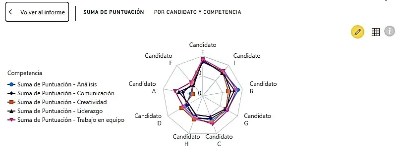
Interpretation of the radar chart
The radar chart provides us with a clear visualization of the performance of multiple candidates (A to H) across five key competencies.
Let's analyze what it shows us.
General patterns
At first glance we can see:
Most candidates have an "irregular" profile, with marked strengths and weaknesses in different areas.
The total area occupied by each polygon gives us an idea of the "overall score" of each candidate.
Candidates E and G appear to have more balanced profiles while others such as A and D show more variability between competencies.
Competency analysis
Analysis (blue line):
Candidate C stands out notably in this competition
Candidates F and H show the lowest values
Communication (orange line):
Candidates B and E have outstanding scores
Candidate A shows a moderate score
Candidate D has the lowest score
Creativity (red line):
Candidate G stands out significantly
Candidates A and D have the lowest scores
Leadership (purple line):
Candidate E stands out considerably
Candidates C and F present low values
Teamwork (pink line):
Candidates B and E show high scores
Candidate D presents the lowest value
Featured profiles
Candidate E: Presents an outstanding and balanced profile, with high scores in almost all competencies, especially in Leadership and Teamwork.
Candidate B: Shows a strong profile in Communication and Teamwork, but with lower performance in Creativity.
Candidate G: Stands out mainly in Creativity, with a relatively balanced profile in the other competencies.
Candidate D: Presents the weakest profile overall, with low scores in all competencies, especially in Communication and Teamwork.
Recommendations based on the analysis
The radar chart not only allows us to compare candidates, but also to make strategic decisions:
If we are looking for a complete leader, Candidate E would be the most suitable option.
If our team needs to strengthen creativity, Candidate G could be a great addition.
For roles requiring strong analytical skills, Candidate C deserves special consideration.
If teamwork is critical to the position, Candidates B and E would be the most suitable.
For a position requiring a balance of competencies, Candidate E emerges as the strongest choice.
This type of visualization allows us to make more informed and objective decisions in the selection process, adjusting the criteria according to the specific needs of the position and the current team.
Alternative Approaches: Comparing Visualizations
There are different ways to display the same data on a radar chart.
Let's look at this second approach, which reorganizes the data to show each candidate as an individual line connecting the five competencies.

Advantages of the first approach (competencies as lines)
Competency Comparison: Makes it easier to identify which candidate excels in each specific competency
Trend Visualization: Allows you to detect patterns in the overall performance of each competency
Gap analysis: Clearly shows the differences between candidates in each dimension
Outlier Identification: Quickly highlight outliers in specific competencies
Advantages of the second approach (candidates as lines)
Individual profile: Clearly shows the "fingerprint" of each candidate's competencies
Profile balance: Allows you to easily identify which candidates have more balanced or unbalanced profiles
Holistic Comparison: Facilitates the comparison of the complete profile of one candidate against another
Identifying specialists: Highlights candidates with a single, highly developed skill
Which approach to choose?
The selection of the approach depends on our analysis objectives:
First approach (competencies as lines): Ideal when we want to compare candidates on each individual competency or identify who excels in specific areas.
Second approach (candidates as pipelines): Preferable when we seek to understand the complete profile of each candidate or need to identify balanced versus specialized profiles.
For a complete selection process, it would be optimal to use both approaches in a complementary manner:
Use the first approach to rank candidates by specific priority competencies
Use the second approach to identify the most balanced profiles or those most in line with the ideal profile defined for the position.
In Power BI, we can easily switch between the two visualizations using the chart settings, swapping the Legend and Axes fields as needed.
Applications beyond Human Resources: The Radar Chart in Marketing
The radar chart is not only valuable in recruitment processes, but also offers significant advantages in the marketing field:
Product analysis
We can use the radar chart to:
Compare products in our range based on multiple attributes (price, quality, durability, design, etc.)
Identify strengths and weaknesses of our products compared to the competition
Discover unmet market niches by identifying gaps in existing product profiles
Customer segmentation
The radar chart allows:
View profiles of different consumer segments
Identify preference patterns by segment
Align product features with the specific needs of each segment
Campaign evaluation
It is also useful for:
Compare results of different campaigns based on multiple KPIs (reach, engagement, conversion, ROI, etc.)
Visualize the balance between different marketing objectives
Identify areas of opportunity in future campaigns
Competition analysis
It allows us to:
Create a visual profile of each competitor's strengths and weaknesses
Identify competitive advantages and areas for improvement
Detect opportunities for differentiation in the market
Limitations and considerations
Like any analytical tool, the radar chart has some limitations that we must consider:
Number of variables: Works best with 5-10 variables. Too many dimensions can make interpretation difficult.
Axis scale: All variables must use the same scale or be normalized to avoid distortions.
Order of variables: The arrangement of dimensions can affect the visual perception of the graph.
Area vs. Shape: The total area of a polygon can be misleading; it's better to analyze the shape and specific values.
Interpretation: Requires some training for users to correctly interpret the results.
Conclusion: The visual power of multidimensional data
The radar chart represents a powerful visualization tool that transcends departments and applications.
Whether in Human Resources assessing candidate competencies, or in Marketing analyzing products and market segments, this visualization allows us to:
Simplifying complexity: Transforming multiple variables into intuitive visual patterns
Reveal hidden relationships: Discover connections between different dimensions that might go unnoticed
Making informed decisions: Relying on a holistic view rather than piecemeal analysis
Communicate results effectively: Present complex data in a way that any stakeholder can understand.
In an increasingly complex and multifaceted business world, tools like radar charts allow us to navigate data with confidence, transforming it into actionable insights that drive better decisions.
Whether we're selecting the next team leader or designing the marketing strategy for a new product, the radar chart provides a visual compass to navigate the complex landscape of multidimensional data.
Would you like to explore more about data visualization and analysis in Power BI?
Visit our Xyclos blog to discover more tools and techniques that will boost your data-driven decision-making.
Become your team's point of reference using visualizations that impact, communicate, and convince. Make clear decisions with well-represented data... because leading with information is leading with power. Are you doing it already?
Suggested courses:


Comments